Choosing a color scheme for a contemporary living space can feel overwhelming, yet it’s the single most impactful design decision you’ll make. The right palette shapes mood, enhances architecture, and defines how your home feels every day. This guide moves beyond paint swatches, offering a holistic approach that considers light, texture, materials, and integrated technology. Drawing on insights from thousands of award-winning contemporary interiors and smart home designs, we break down what truly works. If you’re searching for a clear framework to create sophisticated, personalized modern home color palettes, you’ll find practical, actionable guidance right here.
The Foundation: Core Principles of Modern Color
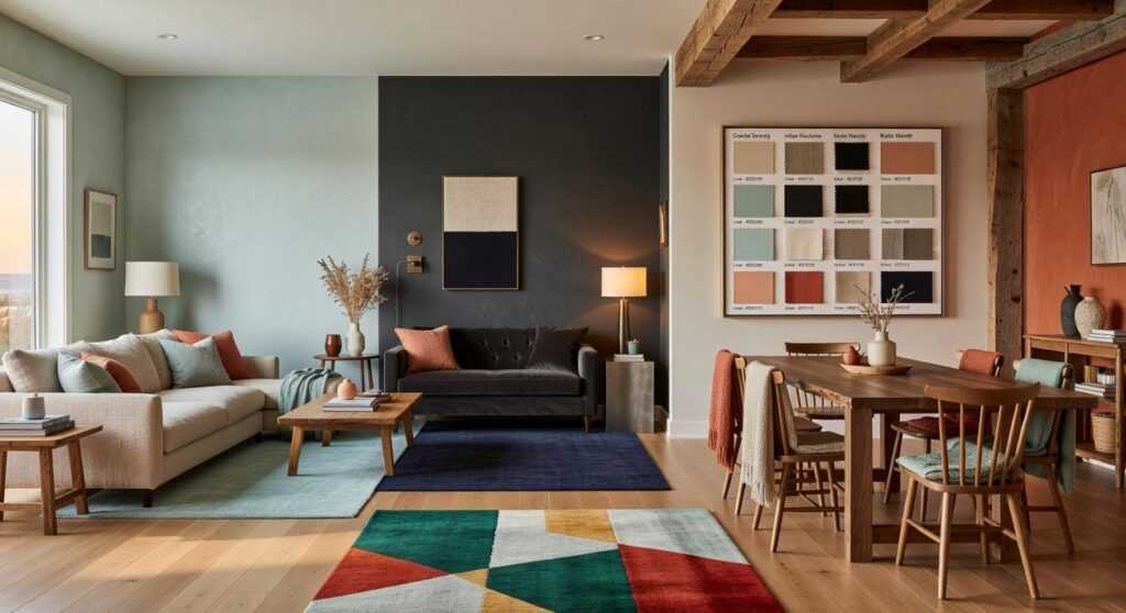
The 60-30-10 Rule, Reimagined
The 60-30-10 rule is a classic interior design formula: 60% dominant color, 30% secondary, 10% accent. Traditionally, that meant bold contrasts. Today, however, contemporary spaces reinterpret it. The 60% is often a neutral backdrop—walls and large furniture in soft white, warm beige, or muted gray. The 30% introduces depth through textiles or cabinetry. The final 10%? A sculptural lamp, a smart thermostat display, or one unapologetically bold cushion (yes, just one).
Some argue this formula is outdated and restrictive. Yet in practice, it provides visual clarity—especially in open layouts and in the rise of multifunctional spaces in urban apartments. Structure, it turns out, creates freedom.
Texture Is the New Color
Because palettes are tighter, texture carries emotional weight. Think matte walls beside a high-gloss media console, nubby linen against smooth leather, or brushed metal next to a soft-touch smart speaker. Texture, in this sense, is the tactile contrast between surfaces that prevents a room from feeling flat. Competitors often stop at color swatches; they miss how finish and material layering create dimension within modern home color palettes.
The Psychology of Neutrals
Greige (a gray-beige hybrid), warm whites, and soft taupes dominate for a reason. Studies show neutral environments can reduce visual stress and promote calm (Journal of Environmental Psychology, 2010). While critics say neutrals are boring, they actually spotlight architectural lines and curated furniture.
Harnessing Natural Light
Finally, light changes everything. Matte absorbs; satin reflects; eggshell sits in between. The same paint can shift dramatically from morning to dusk. Pro tip: test samples on multiple walls and observe them throughout the day before committing.
Three Actionable Palettes for Your Living Space
Palette 1: Biophilic Tech – Merging Nature and Innovation
If you want a living room that feels like a deep breath (but still runs on Wi‑Fi), start here. Combine sage green, warm off-white, deep charcoal, and natural wood tones to blur the line between organic and high-tech.
What to do:
- Paint a sage green accent wall behind your media center.
- Anchor the space with a natural oak console.
- Let black or metallic smart speakers and lighting blend into a deep charcoal backdrop.
The trick is contrast without chaos. Sage softens the presence of black screens, while wood tones warm up metallic finishes. This palette works especially well in open-plan spaces where tech can otherwise dominate. (Think “forest retreat meets Tesla showroom.”)
Palette 2: Warm Minimalism – Sophistication Through Subtlety
Layered mushroom, taupe, and creamy white with a terracotta accent create quiet luxury without sterility.
Recommendation: Paint walls mushroom, choose a slightly darker taupe sofa, and introduce terracotta through ceramic pots or a statement vase. Texture is everything—linen curtains, boucle chairs, matte pottery.
Because the hues are closely related, the room feels cohesive rather than busy. The terracotta acts as a visual heartbeat, preventing the space from fading into beige monotony (we’ve all seen that showroom).
When exploring modern home color palettes, this approach is ideal if you crave calm but still want warmth.
Palette 3: High-Contrast Neutral – Bold and Balanced
Crisp white, deep matte black, and rich cognac leather deliver drama without trend fatigue.
Use black as a grounding element in window frames, fixtures, and furniture legs. Keep walls bright white for a gallery-like backdrop. Then introduce cognac leather through an armchair or sofa for warmth and heritage appeal.
The result? Timeless contrast with modern edge. Clean. Intentional. Unapologetically sharp.
The Smart Home Integration: Color in the Digital Age
Most design blogs stop at paint swatches. The real edge? Treating light and tech as part of your color architecture, not afterthoughts.
Dynamic Scenes with Smart Lighting
A wall isn’t a static backdrop anymore. With systems like Philips Hue or Govee, you can create layered “scenes” that interact with your paint color in real time. Think:
- Focus Scene: Cool white light (4000K–5000K) sharpening the look of soft grey walls for a crisp, productive vibe.
- Relax Scene: Warm, dim lighting (2700K) enriching terracotta or clay tones for a cocoon effect.
- Entertain Scene: Subtle amber with low accent uplighting to add depth (yes, your living room can have main-character energy).
Here’s what competitors miss: lighting temperature shifts how pigments are perceived by up to 30% in warmth or coolness (CIE lighting research). That means your “perfect beige” at noon may feel sterile at night.
Choosing Tech That Complements
Smart devices shouldn’t visually shout over your decor. A Google Nest in Chalk blends into neutral shelving. A Samsung Frame TV with a teak bezel can fall neatly into your 10% accent rule, alongside art and textiles. In modern home color palettes, tech becomes sculpture—not clutter (finally).
Automated Ambiance
Set an automation where lights gradually warm after sunset. Studies show warmer evening light supports melatonin production (Harvard Health). Your space feels cozier and biologically aligned.
Some argue smart lighting is gimmicky. But when color, tech, and circadian rhythm work together, your home responds to you—not the other way around. Pro tip: start with one room and refine before scaling.
Your Space, Your Palette: A Final Checklist
A successful contemporary space isn’t about chasing trends—it’s about building a balanced system of color, texture, and light. With the principles and modern home color palettes you’ve explored, you no longer have to feel paralyzed by endless choices. You have a clear, confident starting point.
Trust the 60-30-10 rule. Layer in texture for warmth and depth. Treat your smart devices as intentional design elements, not afterthoughts.
Now take action: create a digital mood board, order a few paint samples, and map out how your favorite tech will fit into your palette. Start today and turn inspiration into a space that finally feels complete.
 Dustin Brusticker writes the kind of smart living concepts content that people actually send to each other. Not because it's flashy or controversial, but because it's the sort of thing where you read it and immediately think of three people who need to see it. Dustin has a talent for identifying the questions that a lot of people have but haven't quite figured out how to articulate yet — and then answering them properly.
They covers a lot of ground: Smart Living Concepts, Tech-Enhanced Design Elements, Expert Breakdowns, and plenty of adjacent territory that doesn't always get treated with the same seriousness. The consistency across all of it is a certain kind of respect for the reader. Dustin doesn't assume people are stupid, and they doesn't assume they know everything either. They writes for someone who is genuinely trying to figure something out — because that's usually who's actually reading. That assumption shapes everything from how they structures an explanation to how much background they includes before getting to the point.
Beyond the practical stuff, there's something in Dustin's writing that reflects a real investment in the subject — not performed enthusiasm, but the kind of sustained interest that produces insight over time. They has been paying attention to smart living concepts long enough that they notices things a more casual observer would miss. That depth shows up in the work in ways that are hard to fake.
Dustin Brusticker writes the kind of smart living concepts content that people actually send to each other. Not because it's flashy or controversial, but because it's the sort of thing where you read it and immediately think of three people who need to see it. Dustin has a talent for identifying the questions that a lot of people have but haven't quite figured out how to articulate yet — and then answering them properly.
They covers a lot of ground: Smart Living Concepts, Tech-Enhanced Design Elements, Expert Breakdowns, and plenty of adjacent territory that doesn't always get treated with the same seriousness. The consistency across all of it is a certain kind of respect for the reader. Dustin doesn't assume people are stupid, and they doesn't assume they know everything either. They writes for someone who is genuinely trying to figure something out — because that's usually who's actually reading. That assumption shapes everything from how they structures an explanation to how much background they includes before getting to the point.
Beyond the practical stuff, there's something in Dustin's writing that reflects a real investment in the subject — not performed enthusiasm, but the kind of sustained interest that produces insight over time. They has been paying attention to smart living concepts long enough that they notices things a more casual observer would miss. That depth shows up in the work in ways that are hard to fake.